Skip to navigation Skip to main content

Design projects by Sander Vermeulen

Projects

IFM -1

IFM 2

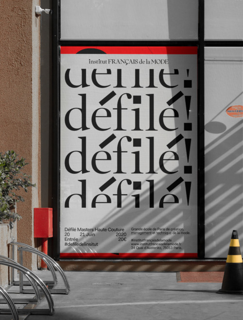
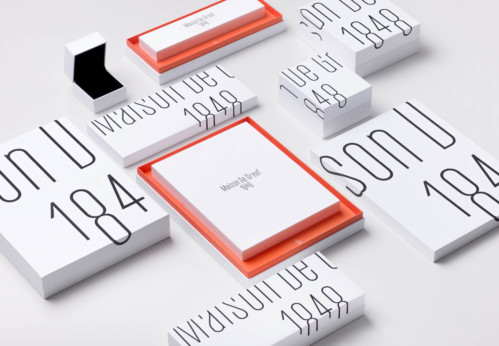
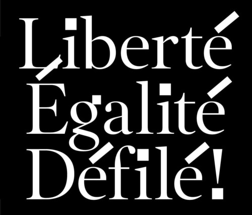
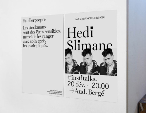
Institut Français de la Mode, Fashion school, 2019 — Parsons, Central Saint Martins, the Academy of Antwerp… they all have a very specific personality that is largely linked to the city where they are located. We played up IFM’s prime location in Paris through a bespoke serif typeface that feels quintessentially French, yet is infused with block-like dots and accents that give it a harder, more youthful edge. Statutory and prestigious, tough and iconoclastic. What is more French than having too many accents?

iFm 5

Institut Français de la Mode, Fashion school, 2019 — Type design. Type production by Matthieu Cortat. I didn’t work on the graphical identity, this was done by Thomas Leon and Lea Wolf. Done at and in collaboration with BaseDesign.

IFM 3b

Institut Français de la Mode, Fashion school, 2019 — Type design. Type production by Matthieu Cortat. I didn’t work on the graphical identity, this was done by Thomas Leon and Lea Wolf. Done at and in collaboration with BaseDesign.

StuBru 2 gif

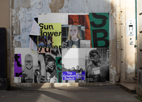
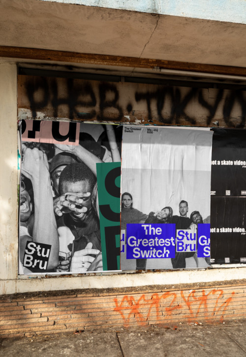
StuBru, 2019, Radio Station — “The new branding is reconnecting us with our DNA: Studio Brussel as a sharp, directional music lover’s radio. The logo is a jolt of energy and it inspires us to explore the boundaries of what StuBru stands for in 2019. We are excited to play around with the work Base has done. Their team exceeded our expectations and I am very grateful for their vision and work on one of our iconic radio brands.” — Peter Claes, Head of Media at Studio Brussel / VRT

StuBru 9a

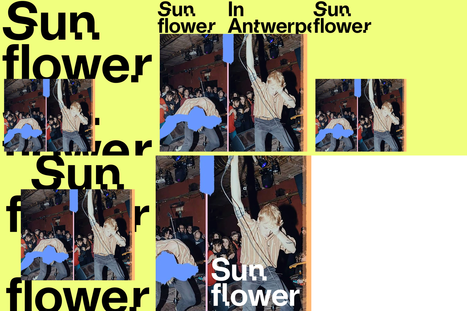
StuBru, 2019, Radio Station — In 2018, we actually won the pitch with a completely different project. We developed a variable font that responded to sounds through code. An identity that comes to life through the content played live on the radio. A musical alphabet.

StuBru 8

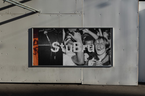
StuBru, 2019, Radio Station — Visual identity and type design. Done at and in collaboration with BaseDesign.

StuBru 9b

StuBru, 2019, Radio Station — Visual identity and type design. Done at and in collaboration with BaseDesign.

August Orts 3

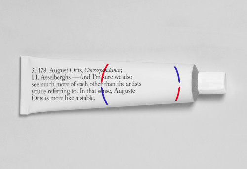
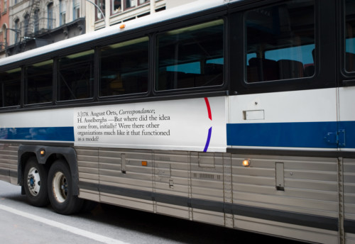
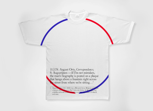
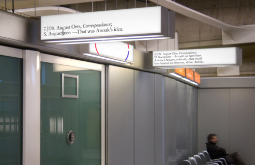
August Orts — In 2010 I designed the exhibition graphics and accompanying book for the exhibition Auguste Orts, Correspondance at the M HKA. The book consisted of a round table discussion between the artists of the August Orts collective and the curator of the exhibition. The design of a round table discussion was something very specific and inspiring. As a joke, I suggested to scatter the conversation across the city on various media outlets. Not sure it would have been the most efficient campaign, but it looked pretty cool...

August Orts 2

August Orts, Correspondance at the M HKA, 2010, Exhibition Graphics and catalog.

August Orts 9

August Orts, Correspondance at the M HKA, 2010, Exhibition Graphics and catalog.

August Orts 5

August Orts, Correspondance at the M HKA, 2010, Exhibition Graphics and catalog.

Deezer 2

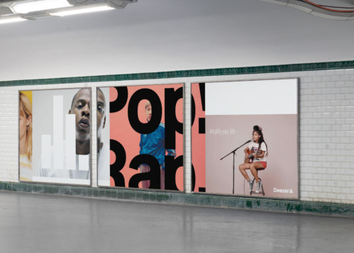
Deezer, Music streaming service, 2019, Design of Visual Codes and Typefaces — For the rebranding of music streaming service Deezer, we proposed different concepts and design directions. The concept of this option was ‘Amplify your life’. We played with extremes, from very turned up and loud to super minimal and intimate. We illustrated their diversity of styles, genres and artists through a play of colors and contrasts. This option wasn't selected. Done at and in collaboration with BaseDesign.

Let me take you to the after party

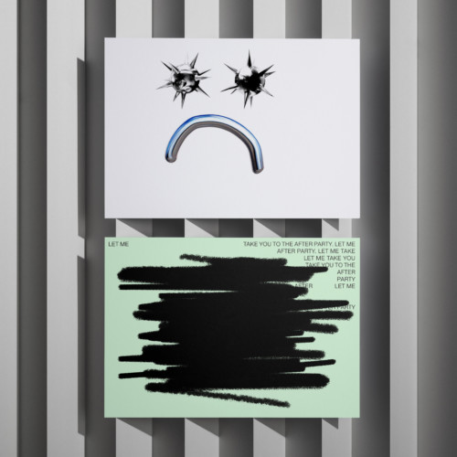
Let me take you to the after party, VVVIP Invitation, 2022. 3D eyeballs by Antoine Barras. Hidden but not forbidden.

ov project 2

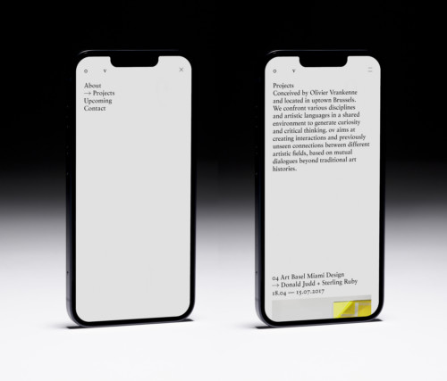
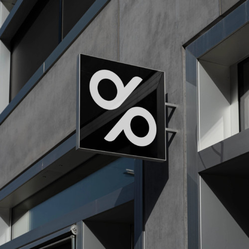
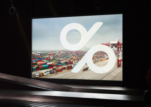
o v project, Art Gallery - Identity and type design.

ov project

o v project, Art Gallery - Identity and type design.

Degroof P 1

Degroof Petercam, Private banking — In 2015, bank Degroof Petercam arose from the mergence of two different company cultures. A more traditional, reserved investment bank versus a more contemporary, straightforward one. When two such different brands mesh, the challenge is to create a new brand universe that respects both cultures, while enthusing all employees over their shared future.

Degroof 2

Degroof Petercam, Private banking — Creation design element and system. The implementation of the identity was done internally. Done at and in collaboration with BaseDesign. — The best of both worlds. The symbol was made out of the initials of both brands. Letters in perfect harmony, endlessly in movement. Bold but friendly, a contemporary but established value. For the word mark we tweaked the serif typeface Romain. Some serif letters turned into sans letters. This mix of both tradition and modernity reflects the new identity concept.

Ori 6

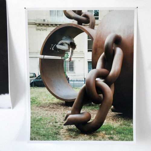
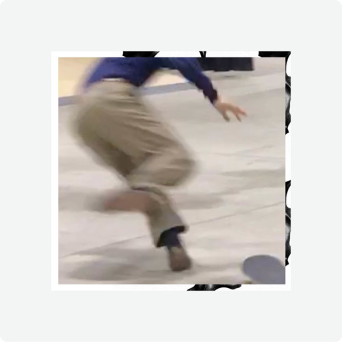
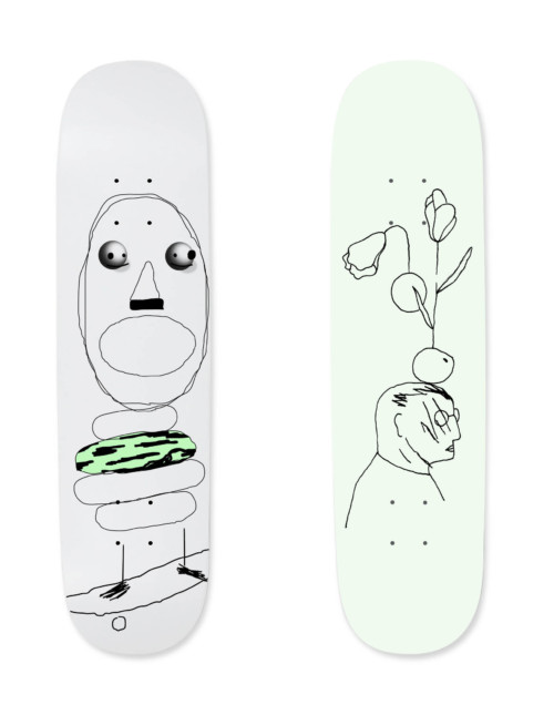
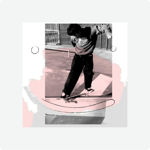
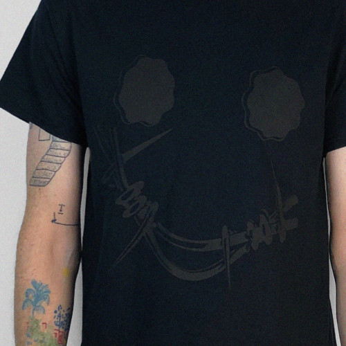
Ori Skateboards, Est.2032. A non-profit project that generates funds for skate park initiatives. 100% of its profits are spent on skate projects — Concept, naming, design, photography, motion, production, model, accounting… the whole shebang. Next to decks and t-shirts we also proposed fine art prints of photographers and artists we admire. The project was launched with works by @gperimony.

Ori 2

We are the things you know at night and cannot name in the morning. We are about dreams, tries and hundred thousand fails. Swollen elbows and sore ankles are our potion. Overcoming fear and embracing pain is our command. The end is not near! We are open in times of uncertainty

Ori 1

Ori Skateboards, non-profit skate project, 2021 — Concept, naming, design, photography, motion, production, model, accounting… the whole shebang.

Ori 3

Ori Skateboards, non-profit skate project, 2021 — Concept, naming, design, photography, motion, production, model, accounting… the whole shebang.

Ori 4

Ori Skateboards, non-profit skate project, 2021 — Concept, naming, design, photography, motion, production, model, accounting… the whole shebang.

Ori 5

Ori Skateboards, non-profit skate project, 2021. Next to decks and t-shirts we also proposed fine art prints of photographers and artists we admire. The project was launched with works by @efrem.angela.

HDK 1

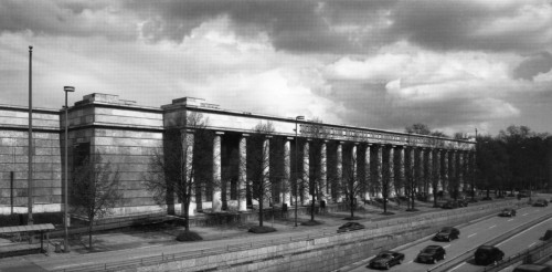
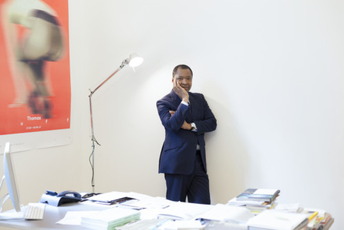
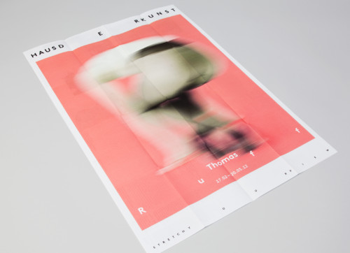
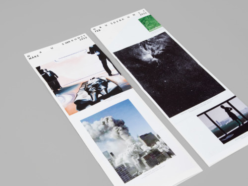
Haus der Kunst, Cultural Institution, 2012 — This was a very special project to work on due to it’s particular context. Haus der Kunst is the first building Adoph Hitler commisioned to foster his view on art. In 2011 the city of Munich appointed Okwui Enwezor as the first director with African origins to lead this prestigieus contemporary art museum. The contrast between the rigidity of the container (the building) and the open-minded program is what we wanted to capture in the identity.

Our concept is the promise Haus der Kunst makes to its public: Stretch Your View. Haus der Kunst became thenceforward a curiosity sherpa. A place where the visitor’s curiosity is fed & guided, where their imagination is ignited, a place that stretches their eye muscles and expands their view.

HDK 2

Based on the idea of elasticity, a concept focusing on the qualities of flexibility, resilience, and adaptability. The visual system is initially founded on a morphing wordmark with irregular spacing inside the letters, which in turn seeks to address the strong Neoclassical features of the architecture through the malleability of the identity system.

HDK 3

Haus der Kunst, Cultural Institution, 2012 — Concept, design and toolbox. Done at and in collaboration with BaseDesign.

HDK 4

Haus der Kunst, Cultural Institution, 2012 — Concept, design and toolbox. The implementation of the identity was done internally. Done at and in collaboration with BaseDesign.

HDK 5

Haus der Kunst, Cultural Institution, 2012 — Concept, design and toolbox. Done at and in collaboration with BaseDesign.

HDK 11

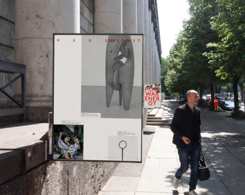
Haus der Kunst, Cultural Institution — In 2020 a graphical campaign system was designed for the ‘Postwar Energy’ exhibition. Done at and in collaboration with BaseDesign.

HDK 8

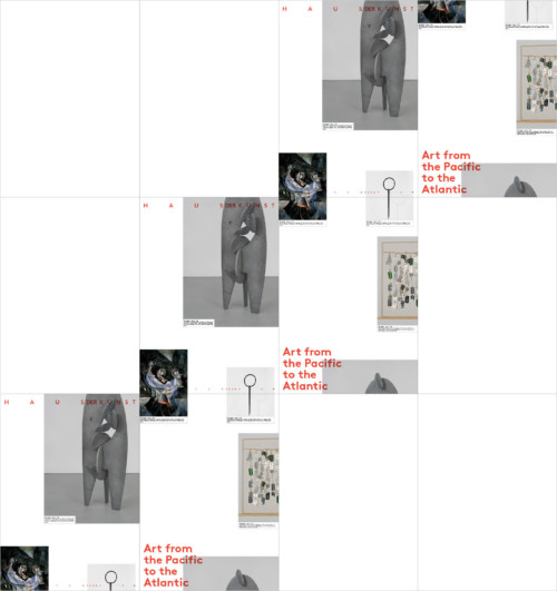
Haus der Kunst, Cultural Institution, 2020 — 4 different posters were created that could be used as a wallpaper motive. The implementation of the campaign was done internally. Done at and in collaboration with BaseDesign.

Bozar 3

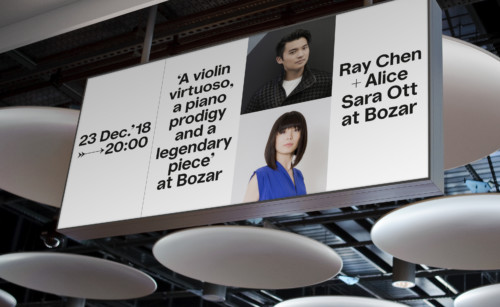
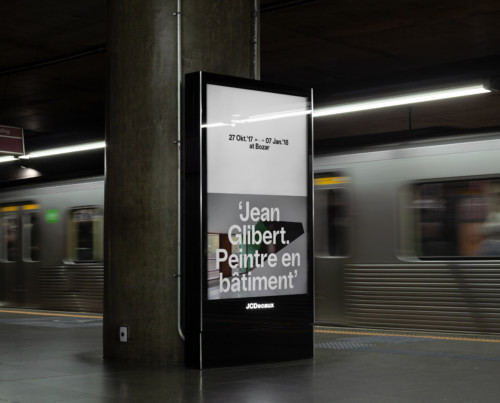
Bozar, Cultural institution, 2018-2020 — A set of principles were laid out to guide a new identity. We created a conversational tone of voice–one that asks questions of its audience and invites them into a dialogue. Delivered via a neutral typeface and a unique multilingualism, with custom flourishes introduced through ornamental punctuation. Next, communicating in real-time with messaging that embraces the spontaneity of content created during its programming. Principle four introduces radical simplicity, because less is more impactful. And finally, acknowledging Bozar as a place in perpetual movement, which is reflected in a modular visual system for its digital and social platforms that can be easily implemented by the institution’s communications team — Copy by Jasmine De Bruycker

Bozar 1

Bozar, Cultural institution, 2018-2022 — Identity and type design. Created in 2018 and implemented by the Bozar team in 2022. Done at and in collaboration with BaseDesign.

Bozar 2

Bozar, Cultural institution, 2018-2022 — Identity and type design. Created in 2018 and implemented by the Bozar team in 2022. Done at and in collaboration with BaseDesign.

Xavier 1

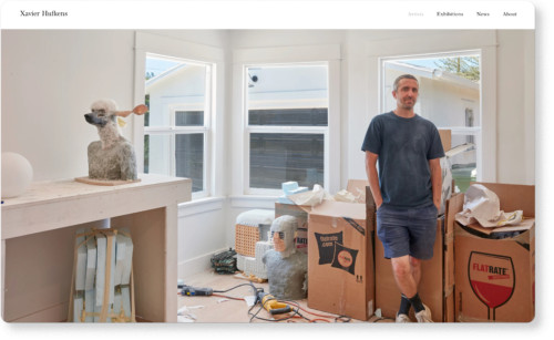
Xavier Hufkens. Creation of the identity in 2013, in collaboration with Guillaume Bokio and 2020 web designs in collaboration with Lukas Liefsoens. Done at and in collaboration with BaseDesign.

Onskin 4

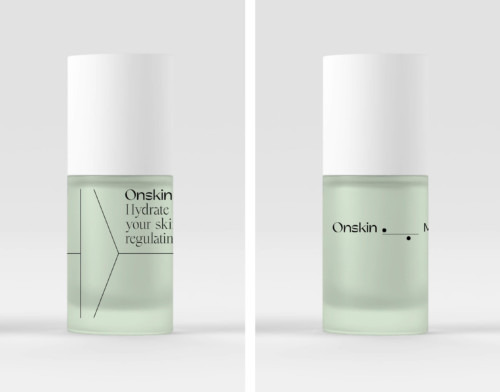
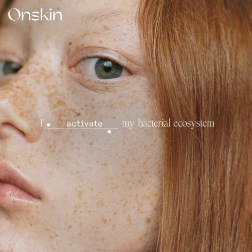
Onskin, skincare, 2020. Regenerative skincare that restores the balance of your skin’s delicate bacterial ecosystem. First design proposals that were not chosen… Done at and in collaboration with BaseDesign.

Onskin 3

Onskin, skincare, 2020. Regenerative skincare that restores the balance of your skin’s delicate bacterial ecosystem. First design proposals that were not chosen… Done at and in collaboration with BaseDesign.

Mix 3

Mix, Hotel, restaurants, library, gym, events and bar, 2022 — Logo design. Done at and in collaboration with BaseDesign.

Munt 1

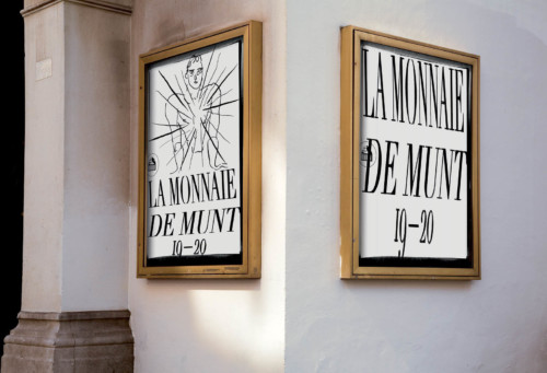
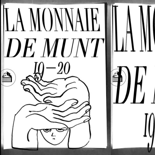
De Munt/La Monnaie, Opera House, 2019-2020 season campaign. The first time we deviated from the existing identity to a more disruptive punk attitude. Design in collaboration with Lea Wolf, illustrations by Charlotte Chauvin. Done at and in collaboration with BaseDesign.

Munt 2

De Munt/La Monnaie, Opera House, 2019-2020 season campaign. Design in collaboration with Lea Wolf, illustrations by Charlotte Chauvin. Done at and in collaboration with BaseDesign.

Munt 4

De Munt/La Monnaie, Opera House, 2019-2020 season campaign. Design in collaboration with Lea Wolf, illustrations by Charlotte Chauvin. Done at and in collaboration with BaseDesign.

Fondation Cartier 1

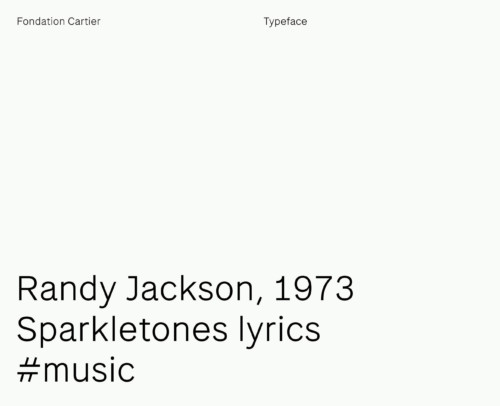
Fondation Cartier, Art Foundation, 2016. Design of a web-friendly secondary font for the Fondation Cartier website. Type production was done by Matthieu Cortat. Done at and in collaboration with BaseDesign.

Fondation Cartier 2

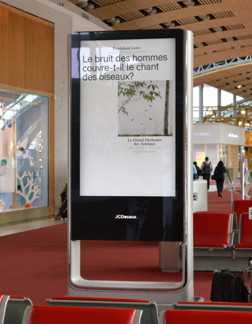
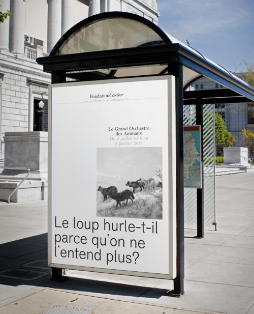
Fondation Cartier, Art Foundation, 2016. We tried to sell them sell them this grotesque display, but unfortunately that didn’t fly. But we used that 2 years later to win the pitch for le Grand Palais in Paris. Done at and in collaboration with BaseDesign.

Fondation Cartier poster

Fondation Cartier, Art Foundation, 2016. We tried to sell them sell them this grotesque display, but unfortunately that didn’t fly. But we used that 2 years later to win the pitch for le Grand Palais in Paris. Done at and in collaboration with BaseDesign.

Fondation Cartier 4

Fondation Cartier, Art Foundation, 2016. We tried to sell them sell them this grotesque display, but unfortunately that didn’t fly. But we used that 2 years later to win the pitch for le Grand Palais in Paris. Done at and in collaboration with BaseDesign.

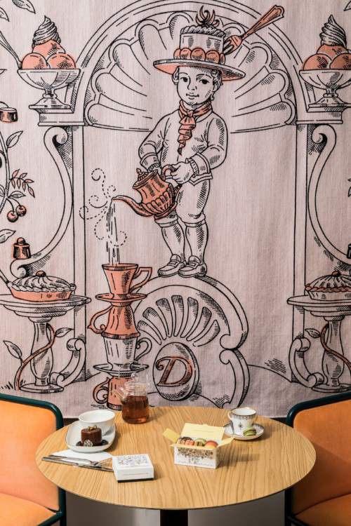
Debailleul 3

Debailleul, Belgian Chocolat and Tea House - Identity design in collaboration with Lara Berg. Type design by Matthieu Cortat. Illustrations Christine Van Wassenhove. Done at and in collaboration with BaseDesign.

Debailleul 2

Debailleul, Belgian Chocolat and Tea House - Identity design in collaboration with Lara Berg. Illustrations Christine Van Wassenhove. Done at and in collaboration with BaseDesign.

Nothing 2

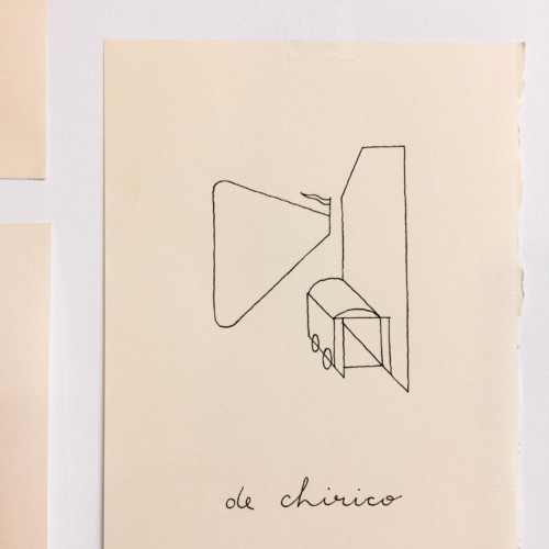
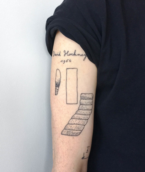
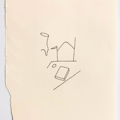
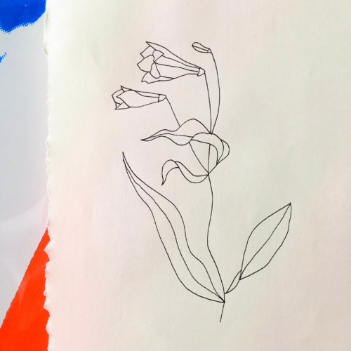
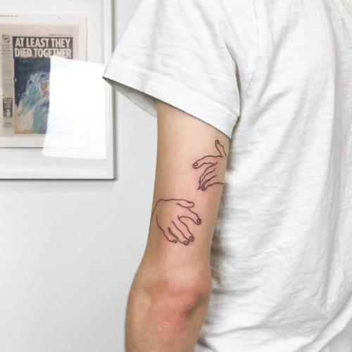
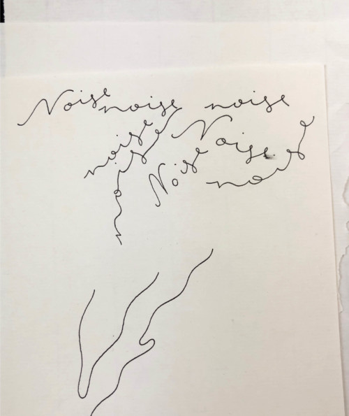
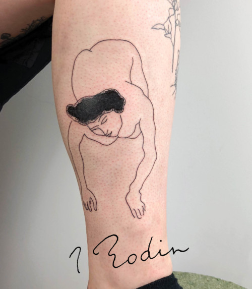
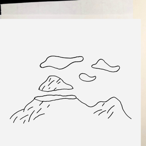
Nothingness tattoo is a personal project I did between 2016 and 2019. I took on the challenge to learn to tattoo fine lines. I wanted to develop a style that consisted of B/W line drawings with different shapes and subjects than most tattoos I saw at the time. A mix of my own drawings, copy or interpretations of work by artists I like. De Chirico, Hockney… Unfortunately, people don’t always choose the drawings you would most like to tattoo thus I lost interest. I inflicted a little over a hundred tattoos and seven billion drawings.

Nothing 1

Nothingness tattoo, I want your everything, Professional scratcher ◕‿◕. Let me make your mistake, 2016 — 2019.

Nothing 3

Nothingness tattoo, I want your everything, Professional scratcher ◕‿◕. Let me make your mistake, 2016 — 2019.

Nothing 7

Nothingness tattoo, I want your everything, Professional scratcher ◕‿◕. Let me make your mistake, 2016 — 2019.

Nothing 5

Nothingness tattoo, I want your everything, Professional scratcher ◕‿◕. Let me make your mistake, 2016 — 2019.

Nothing 8

Nothingness tattoo, I want your everything, Professional scratcher ◕‿◕. Let me make your mistake, 2016 — 2019.

Nothing 9

Nothingness tattoo, I want your everything, Professional scratcher ◕‿◕. Let me make your mistake, 2016 — 2019.

Nothing 10

The mountain who dreamed of being a cloud. Nothingness tattoo, I want your everything, Professional scratcher ◕‿◕. Let me make your mistake, 2016 — 2019.

Gaston

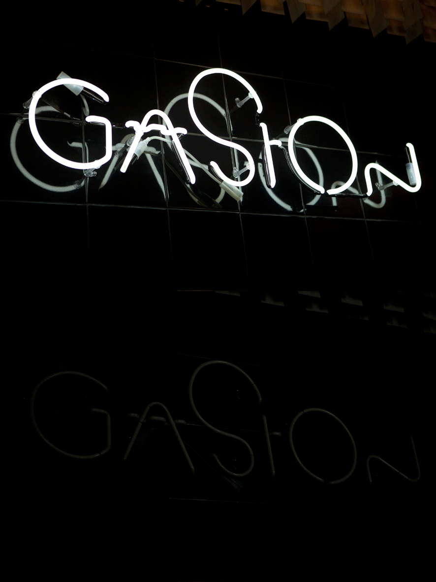
Gaston, ice cream shop, 2018. I scream, you scream, we all scream for ice cream — Logo design. Done at and in collaboration with BaseDesign.

Dandoy 1

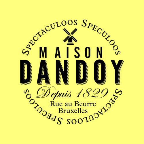
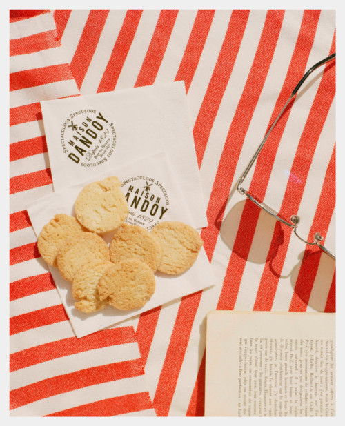
Maison Dandoy, Cookies maker, 2016 — We created a past forward brand. Using Dandoy’s history to build a brand: Since 1829, older then Belgium. The wordmark was taken from the motherhouse shop window in rue au beurre. Maison was added, home = family. And we focused on their flagship product speculoos. Dandoy crafts biscuits wery seriously without taking itself too seriously… — Logo design. Done at and in collaboration with BaseDesign.

Dandoy 2

Maison Dandoy, Cookies maker, 2016 — Logo design. Done at and in collaboration with BaseDesign.

Maison de greef

Maison De Greef, Jewelry store, 2015 — Design of visual codes, no implementation. In collaboration with Thomas Leon. Done at and in collaboration with BaseDesign.

Sparks

Sparks, Meeting room & Event space, 2021 — In general a good meeting leads to change, it generates transformation. There is a before and an after… It is going from state A to B. From problems to solutions; from questions to decisions; from uncertainty to clarity; from old habits to innovation or from a group of individuals to one team. The mission of Sparks is to help initiate and facilitate these moments of change — Concept and design, no implementation. Done at and in collaboration with BaseDesign.

Vuitton 1

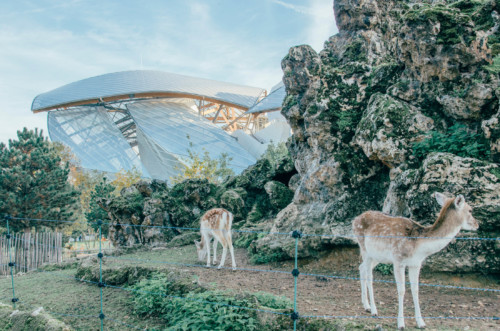
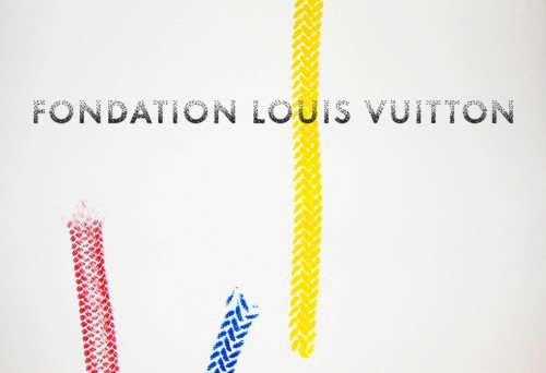
Fondation Louis Vuitton, Museum, 2016 — The idea behind the design of the museum by Frank Gehry was a sailing ship that would take the visitor on a new cultural journey. We introduced the concept of Endless Horizons for the museum’s identity — Identity design and implementation. In collaboration with Jonas Nicollin. Done at and in collaboration with BaseDesign.

Vuitton 2

Fondation Louis Vuitton, Museum, 2016 — Identity design and implementation. In collaboration with Jonas Nicollin. Done at and in collaboration with BaseDesign.

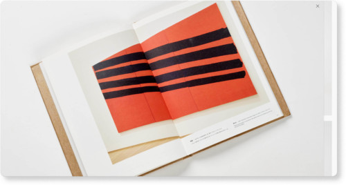
Erwin Wurm

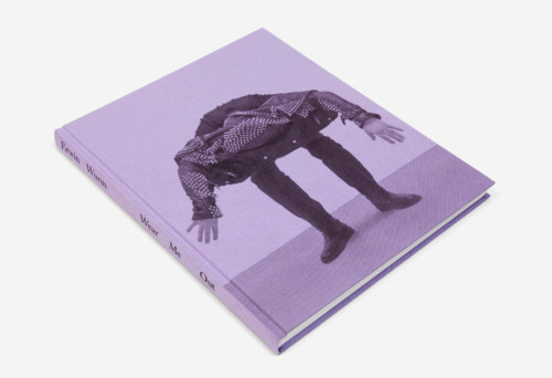
Erwin Wurm, book, 2012 — Exhibition catalog for Erwin Wurm’s show ‘Wear me Out’ at Middelheim Museum in Antwerp — Book design. Done at and in collaboration with BaseDesign.

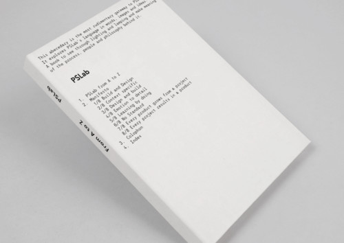
PSLab

PSLab, Lighting, 2016 — Type design and design direction. Type production by Matthieu Cortat. Book design by Lea Wolf. Done at and in collaboration with BaseDesign.

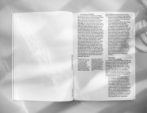
Tierra 3

Tierra Celeste, Book, 2010. Exhibition catalog for the Tierra Celeste show with paintings by José Alberto Marchi. In this show, the Argentinian artist worked with almost completely transparent oil paint. This play with transparency was the common thread through the conception of the catalogue. In 2010, the book won the Fernand Baudin Prize and the Plantin Moretus Prize for best design in the art publications category.

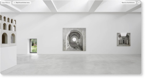
A vervoordt 1

Axel Vervoordt, Art and Antique Gallery, 2018. Type design; web designs in collaboration with Delphine Volkaert and Lukas Liefsoens. Done at and in collaboration with BaseDesign.

A vervoordt 3

Axel Vervoordt, Art and Antique Gallery, 2018. Type design; web designs in collaboration with Delphine Volkaert and Lukas Liefsoens. Done at and in collaboration with BaseDesign.

previous... next...

About etc.

If you have a branding question that needs solving, let’s talk. Together with a network of all types of brand developers, we love puzzels. We are a well without a bottom… let me take you to the after party.

Approach

What I like about cycling? As a designer I’m of course attracted to the beauty of a bike, but what I love most about biking is the mental masochism. The wind flowing through my hair, the brown stripe in my tight pants, blowing my snot away. It’s a simple game. You push, you go forward. You push harder, you go faster. You keep on pushing until you drop: you feel great.

When a professional cyclist falls at 50 km/hour on the asphalt, he can’t start whining like a football player would, he needs to get up fast. The rest of the peloton isn’t waiting and if he can’t get back in that peloton, the game is over. Cycling is about rain, wind, mud, dust. It’s about a 20% steep climb on a cobble-stone road called ‘de muur’. It’s about races called ‘l’Enfer de Nord’ or ‘A Sunday in Hell’.

Wind tunnels, NASA technology, engineers, physical and mental trainers, dieticians, all are needed to help the cyclist do this simple thing: push harder. It’s not about doing your best, it’s about giving 300%, being so tired that you can’t even lift up a spoon. But the only thing you’re thinking about is the next ride with your friends. This is how I like to design.

Contact

About

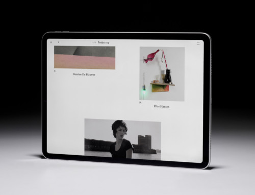
This website is a compilation of projects I, Sander Vermeulen, have worked on over the past 20 years. It is a mix of designs that eventually made it to the brand identity and proposals that were not approved. On this subject I share the same opinion as Rem Koolhaas, namely that just because a design was ultimately not chosen does not mean that the creative idea is inferior or not worth sharing.

A second note is that at Base Design, the delivery of a tool box is almost always the final piece of a job. Often the identity is implemented by a local designer hired by the client or his internal design team. In many cases, I only intervened at the start of a job to help create the building blocks of the identity. The finality of my designs are often no more than simulations.
Close